There are some projects that are particularly deserving of special attention, as they reflect a desire to preserve heritage while adapting it to the present day. Design & Meer’s renovation of this 1850 barn, which was initially destined for the wrecking ball, is a wonderful example of perfect symbiosis between innovative materials, like HIMACS, and traditional materials.
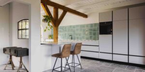
For the owners, a young couple with a passion for design, the original idea was to combine the old barn with a modern kitchen, without marring the structure’s charm.
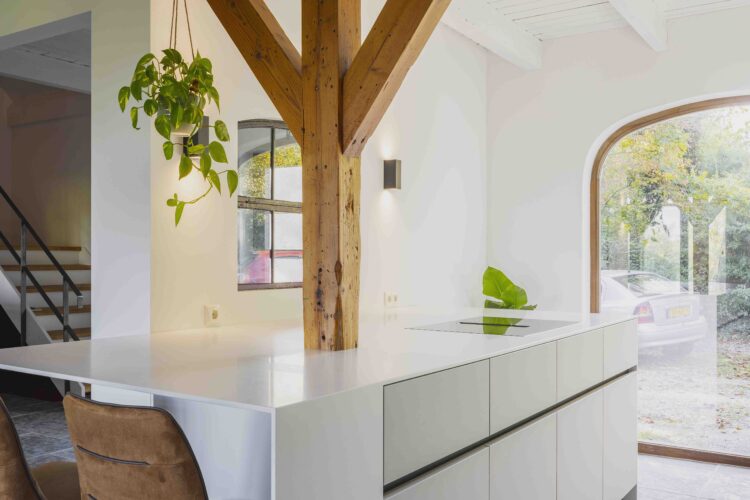
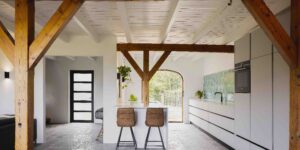
Given the available space and volume, the kitchen was deliberately designed to be spacious, with plenty of storage options, but minimising the use of upper cabinets, so as not to block any of the room’s natural lighting, which was already limited by the small number of windows.
LET THERE BE LIGHT
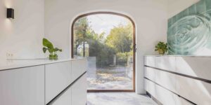
Long, uninterrupted lines serve to visually accentuate the length of the kitchen and, to maximise its brightness, the large window on the southern wall of the house was given a matte finish to prevent it from reflecting light like a mirror, instead diffusing it through the room.
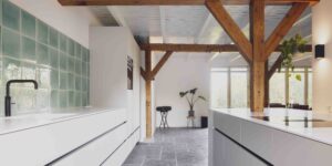
The choice of colour – white – not only emphasises that brightness but also enhances the wall tiles that catch the eye. A few black touches break the monotony and intensify the sense of perspective, expanding the perception of space.
To create clean lines, incorporating the central beam without compromising the kitchen’s design, a seamless material with perfect finishes was needed for the countertops and the sides of the island. “For that reason, we chose HIMACS, because it gave us that smooth, even surface, and the material itself is simply fantastic to work with. In addition, it is easy to clean, because any marks are only superficial, making it perfect for use as a kitchen countertop,” explains Design & Meer.
The sink, likewise made of HIMACS, fits flawlessly and seamlessly into the countertop, creating that perfect finish and also guaranteeing good hygiene because it is so easy to maintain.
The kitchen island extends into a bar, which needed to be robust enough for the chosen design but also the same thickness as the rest of the worktop.
A BACKSPLASH LIKE A REFLECTING POOL
One of the most eye-catching parts of this renovation project was the tiled wall, extending more than 13 metres in length, which intrigues visitors, draws them in and makes them want to reach out and touch it. Made by Studio Doorbakken, which takes everyday objects and transforms them into something unique and personal, it is a 3D model of a photograph of a falling drop of water, a picture taken by the owner, with water symbolising purity and cleanliness.
“As a company, we love to push the limits and see how we can transcend design. I always say that, ‘the material and physics permitting, we can do anything.’ In this case, HIMACS gave us the chance to get the client a little out of their comfort zone, to make this project something truly special and unique, a homey space where family and friends will enjoy spending time together.”
PROJECT INFORMATION
LOCATION: Nieuwe Wetering, Netherlands
DESIGN AND PRODUCTION: Design & Meer
HIMACS SUPPLIER: Baars & Bloemhoff
HIMACS ELEMENTS: HIMACS Alpine White for countertops, sink and sides of the kitchen island
PHOTO CREDITS: © Wouter van der Sar Photography
Project website: http://www.himacs.eu


